Simplifying Navigation for First-Time Users in WebMD’s Wellness App
CASE STUDY | HEALTHCARE
ABSTRACT
WebMD is in the process of designing and launching a mobile platform designed to support employee health and well-being, offering tools to assess health, set personal goals, and access company benefits. Our team conducted moderated usability testing to evaluate the first-time user experience. While participants appreciated the app’s extensive health and wellness features, they encountered challenges navigating and accessing these features.
This case study details how we uncovered those pain points and provided actionable design recommendations to help users move through their health journey with clarity and confidence.
CLIENT
WebMD Health Services
TEAM
Shayla Singh
Jasmine Chen
Aayushi Bharadwaj
Shriya Chipde
TIMELINE
4 weeks
Spring 2025
THE TASK
WebMD: “We’ve developed a new mobile platform for employee health and well-being that is feature-rich. We want to test it with employees to understand how we can simplify the in-app navigation from the home screens.”
WebMD Health Services is designing and building a mobile wellness app for companies to offer to their employees. The platform includes several fantastic and helpful tools for health assessment, rewards tracking, personal goal-setting, and access to company benefits.
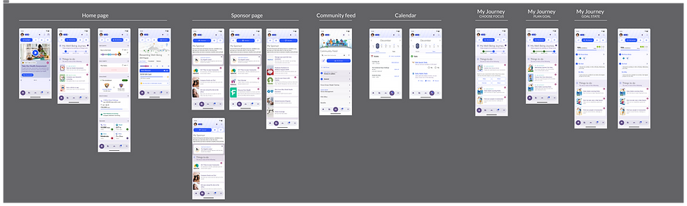
They engaged my team and I to test the app's homepage and subsequent screens to evaluate how easy or difficult it is for new users to navigate its features.
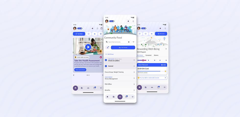
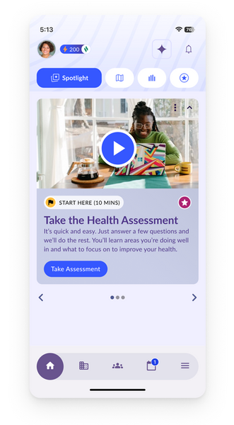
Overview of the home screens that were part of the usability testing
THE CHALLENGE
Helping first-time users confidently begin their wellness journey.
Although the homepage featured useful tools that could support users’ health and well-being, its layout with numerous icons and dual navigation bars caused confusion for first-time users.
Our goal was to improve early user engagement by identifying navigation roadblocks and surfacing features users found valuable but hard to access. Specifically, we aimed to reduce confusion around icon labels, improve feature visibility on the homepage, and ensure users could intuitively access their wellness progress.
We set out to answer: How do we reduce friction and make the core features of the mobile app more accessible for new users from the start?
The Plan: Conducting in-person moderated usability testing to evaluate how new users interacted with the homepage screens.

WHO WE TESTED
Employees aged 25–65 engaging seeking lifestyle improvements.
To reflect WebMD’s user base, we recruited 8 participants through Panelfox:
-
Ages 25–65
-
U.S.-based working professionals
-
Mix of wellness seekers and reward-motivated users
-
Accessed the app on both mobile and desktop
THE METHOD
We conducted in-person usability sessions with participants by observing how they completed assigned tasks.
We conducted five moderated usability sessions in-person, each lasting approximately 30–40 minutes.
Sessions included a warm-up to give context on the study, narrate the scenario and then begin five task-based exercises, followed by a few post-task questions. We used Figma to capture observations and identify patterns across user behavior.
The Scenario: You’ve just logged into your company's well-being platform for the first time. This platform is designed to guide you in making meaningful changes to improve your wellbeing by helping you assess your health, set personal goals, track your progress, and earn rewards. You want to get the most out of it.
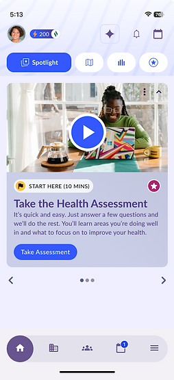
TASK 1 - HEALTH ASSESSMENT
You’re on the homepage and ready to start your health journey. If you wanted to check in on your health, where would you start?
TASK 2 - MY JOURNEY
Now that you've started your health journey, you're ready to set a personal goal. How would you go about setting this up?
TASK 3 - MY ACTIVITIES
You're thinking about the activities you’re already doing, or could be doing, to support your health goals. How would you find and check those activities?
TASK 4 - CALENDAR
You have an upcoming call with a health coach, find out when the call is.
TASK 5 - REWARDS
You want to see how you’re doing with your progress and if you’ve earned any rewards. Where would you go to check on that?
TASK 6 - MY SPONSOR
You’re curious about what other benefits your company offers through this platform. How would you find that information?
The 8 participants were encouraged to think aloud, allowing us to capture their thought processes, assumptions, and frustrations.
USER PAIN POINTS
Participants experienced navigation challenges, found icon meanings unclear, and noted a lack of contextual information.
The users were impressed by the app’s features and felt it could be a valuable tool for tracking their health and wellbeing as working professionals.
While users appreciated the visual design and concept of the app, they encountered several usability challenges. Here are some of the key findings and thoughts shared by our participants:
Users understood that they need to start by taking the health assessment.
100%
☺️
Users found the icons to be unclear or confusing.
100%
😭
Users felt the navigation was challenging and could be more intuitive.
83%
🤔
1. Users were confused by abstract or misleading icons.
Participants misread icons and were unsure of their meanings, often needing to click around to find the right feature.
“I thought the map icon would take me to clinics, not my goals.”
😕
2. The homepage lacked actionable prompts beyond the first steps.
Once the assessment was completed, users weren’t sure what to do next. Important tools were buried.
“There’s nothing here after the assessment. I kept scrolling expecting more.”
🤔
3. Labels and visual hierarchy were inconsistent across screens.
Key pages like "My Activities" lacked clear headers or prioritization of personal data.
“I expected my stats or goals to be at the top, but I had to dig for them.”
😐
4. The search tool was hidden, and new users lacked clear guidance.
Users didn’t notice the search bar was in the hamburger menu and suggested that some sort of welcome guide would have helped.
“I use a hamburger menu or search bar to navigate in any app.”
🫤
DESIGN FIXES
From feedback to fixes, we can simplify the experience for new users in six key ways based on our usability testing.
The solutions are based on key areas of friction like ambiguous iconography, missing navigation labels, underutilized homepage space, and the absence of onboarding or contextual help.
RECOMMENDATION 1
THE PROBLEM
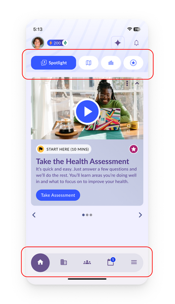
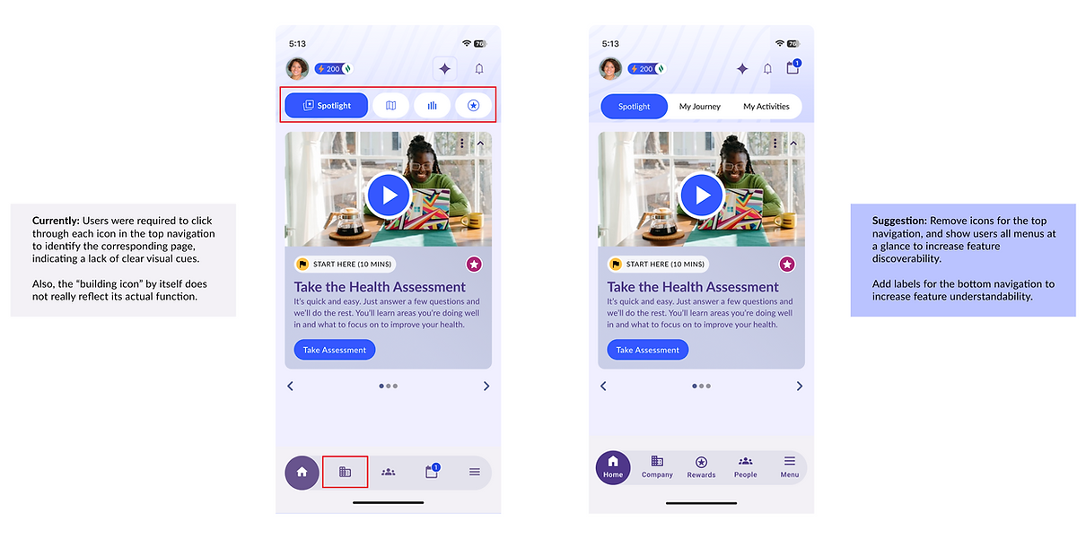
Participants had difficulty navigating the app due to hidden labels in the top navigation and unclear iconography in the bottom navigation.
For example, participants struggled to access “My Journey,” “My Activities,” and “My Rewards” due to hidden label visibility in the top navigation bar.
THE SOLUTION
Add labels to the bottom navigation to improve clarity, and remove icons from the top navigation to reduce confusion and make features easier to understand and discover.
Before
After
.png)
RECOMMENDATION 2
THE PROBLEM
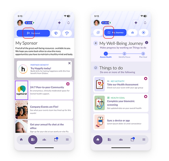
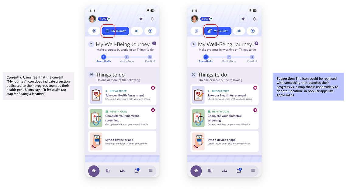
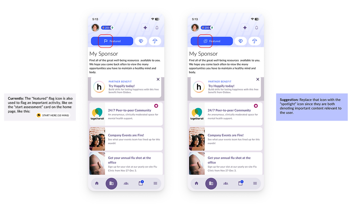
Participants struggled to interpret and trust key icons due to misleading metaphors and poor alignment with their intended functions.
The “My Journey” icon was consistently mistaken for a map or location tool, and the “Featured” flag icon did not clearly convey priority content.
This lack of clarity reduced users’ confidence in navigation and hindered their ability to quickly find relevant features.
THE SOLUTION - PART I
Use alternative icons for “My Journey” to better reflect their corresponding functionalities, which helps to improve understandability and design consistency.
Before
After
THE SOLUTION - PART II
Use alternative icons for “Featured” to better reflect their corresponding functionalities, which helps to improve understandability and design consistency.
Before
After
RECOMMENDATION 3
THE PROBLEM
The My Activities page lacks clear information hierarchy, making it difficult for users to scan and locate key personal details.
Participants expected to see personal health stats, like daily step count, upfront, but these were buried beneath several other content tiles.
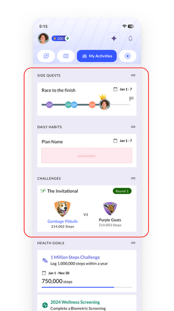
THE SOLUTION
Enhance the information hierarchy on the “My Activities” page to prioritize key personal data and introduce a clear header to ensure design consistency and improve navigation.
Before
After
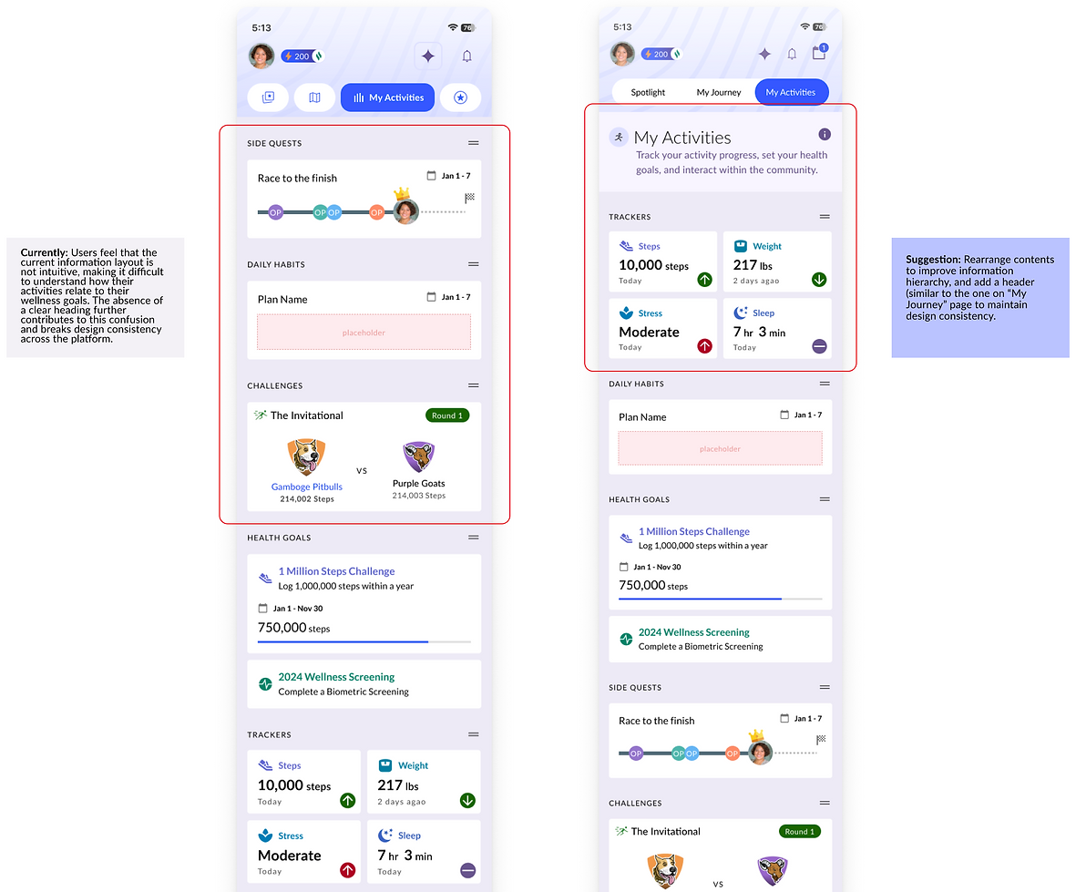.png)

RECOMMENDATION 4
THE PROBLEM
The homepage lacked depth and failed to guide users beyond the initial health assessment.
Without clear entry points to other features, users were left uncertain about what to do next and had to rely on trial and error to navigate the app.
THE SOLUTION
Make the homepage more actionable by adding personalized quick-access tiles that serve as clear gateways to key features beyond the initial assessment.
Before
After

RECOMMENDATION 5
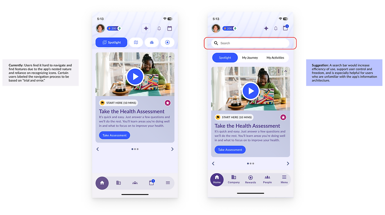
THE PROBLEM
Participants struggled to complete tasks due to complex navigation and hidden features.
The search function, hidden in the hamburger menu, was underutilized. Participants expected a more visible, direct path to the content they were looking for.
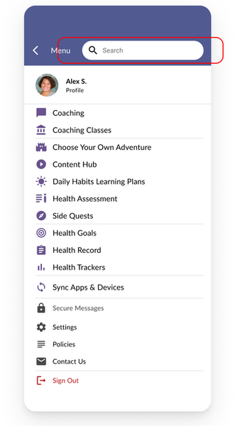
THE SOLUTION
Move the search bar from the hamburger menu to homepage to increase its discoverability.
Before
After
.png)
RECOMMENDATION 6
THE PROBLEM
First-time users lacked guidance, resulting in confusion and missed features.
Without an onboarding process, users were unsure how to navigate the platform or understand its core functionality, leading to low engagement and discoverability.
THE SOLUTION
Introduce onboarding splash screens and tooltips to highlight core features, reducing the learning curve, boosting feature awareness, and enhancing the first-time user experience.
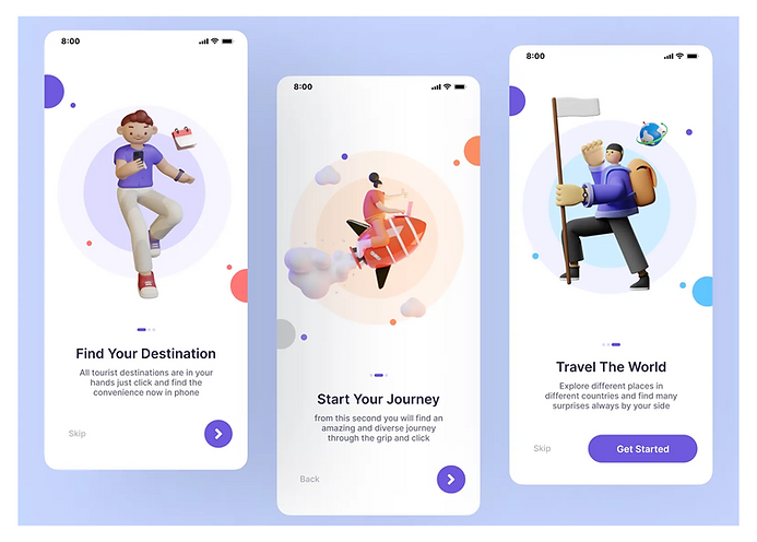
An example of onboarding screens designed to guide new users through key features and actions.
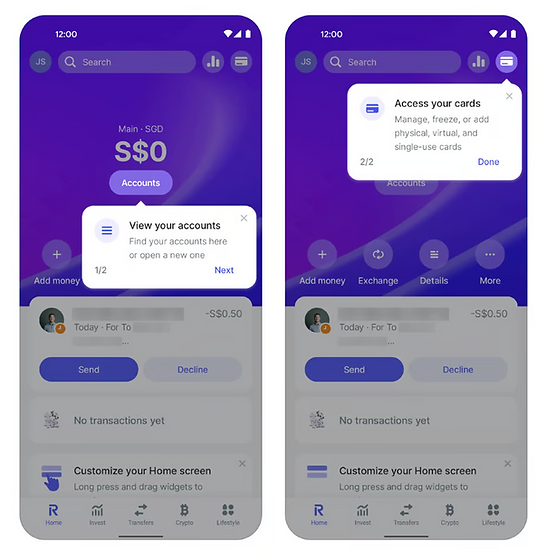
An example of using tooltips that can help new users quickly understand what an icon or feature represents.
CLIENT RESPONSE
WebMD: "We had an idea that it was a lot of icons and features on the homepage, and can now see what can make navigation easier for new users so they can fully access and benefit from our platform."
WebMD's team responded positively to our findings and mockups. The insights this usability study validated some of their initial concerns. They appreciated the real user insights that highlighted friction points they hadn’t considered.
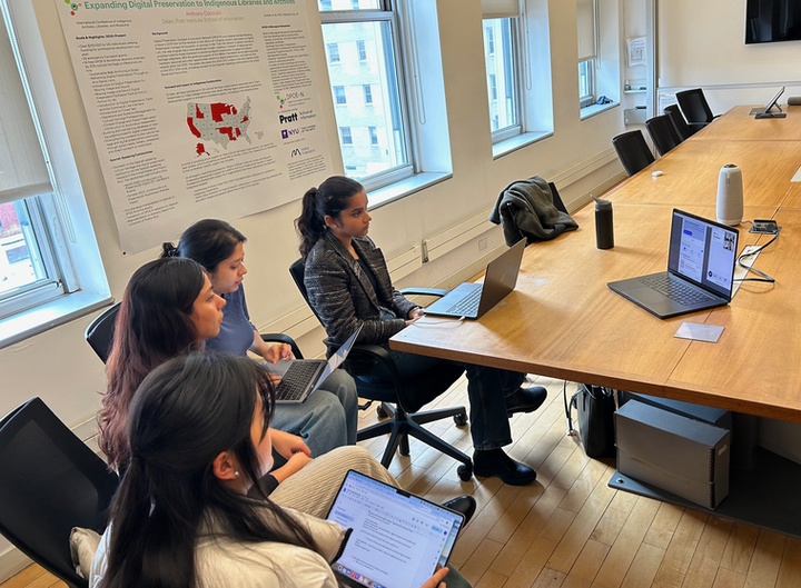
The team on call with the product design team at WebMD
REFLECTIONS & KEY LEARNINGS
WebMD is a well-known and trusted name in the healthcare space, and it was an honor to collaborate with their team on such an impactful product.
This project provided the opportunity to observe real users engaging with a high-stakes wellness platform for the first time. Through testing, analysis, and iteration, we deepened our understanding of how small design decisions can significantly shape a user's experience.
Here’s what stood out most:
-
I learned how critical intuitive navigation and iconography are for first-time users.
-
I saw how simple UI details, like label placement or onboarding, can positively impact overall engagement.
-
Most importantly, I practiced transforming raw qualitative feedback into clear, design-ready insights.
Next steps:
If continued, I would validate our prototype changes and test with users again. Additionally, I would explore adaptive onboarding techniques tailored to user motivation types (e.g., reward-seekers vs. wellness-focused users).