Design systems · Scalable UI
From fragmented UI to a cinematic system
Building Montage for the Jacob Burns Film Center: principles, tokens, a shared UI kit, and documentation teams can actually use.
40+ components in one UI kit
9-week design systems studio
WCAG contrast at the foundation
Figma Community + Zeroheight
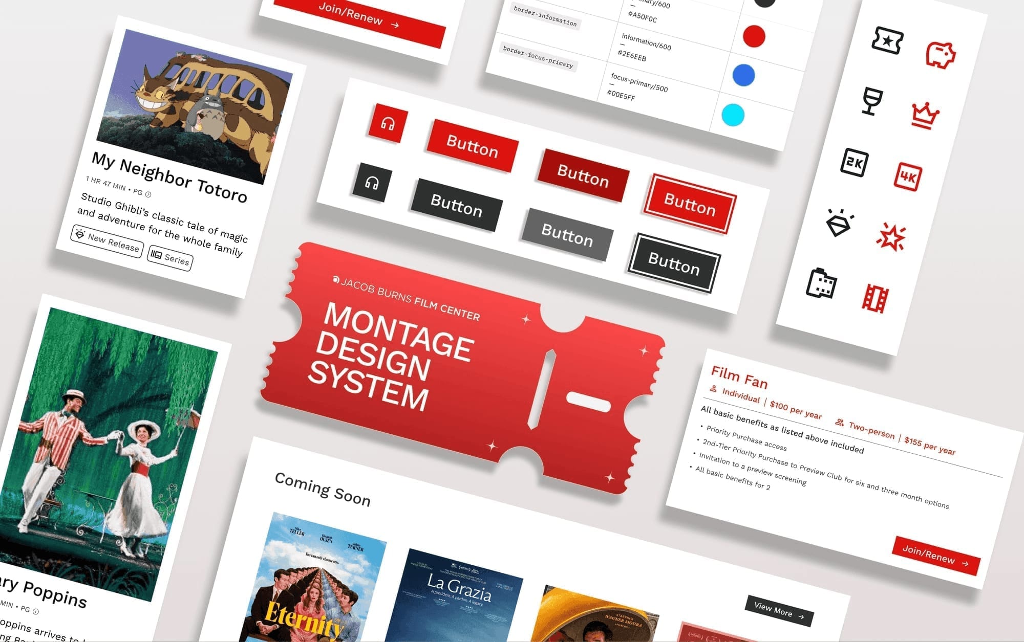
I helped build Montage: a cinematic design system that turns JBFC's fragmented digital presence into a cohesive, accessible, and scalable experience.
- Role
- Product designer: website deconstruction, system development, documentation
- Timeline
- 9 weeks
- Tools
- Figma, Zeroheight
- Team
- 4 UX designers · design systems studio
About
A cinematic system for JBFC's digital experience
The Jacob Burns Film Center is more than a movie theater. It is a cultural hub that screens 400+ films annually, hosts 100+ special events, and educates 5,000+ students a year. Yet its website was burdened by dense layouts, inconsistent navigation, and accessibility gaps.
Montage reimagines that presence through a cinematic storytelling lens: accessible foundations, modular components, and a unified visual language that reflects JBFC's spirit.
Challenge
A strong legacy.A broken digital experience.
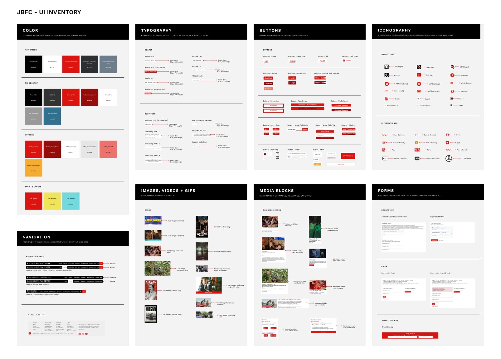
Using the Atomic Design framework, we deconstructed the JBFC website into its smallest elements and built a UI inventory. Here's what we found:
01
Lack of component consistency
11+ button variations · 6 icon styles · Inconsistent color usage
02
Typography without hierarchy
6+ type styles · Mixed fonts and weights · Inconsistent text treatments
03
Unstructured content & media
7+ image sizes · No grid alignment · Irregular content blocks
How might we design a cohesive system that embodies JBFC's cinematic identity while delivering a seamless, accessible, and scalable digital experience?
Solution
Introducing the Montage Design System
To address JBFC's challenges, we established core design principles, developed a unified Montage UI kit tested with users, and then documented it for consistency and scalability.
How we built it
Principles, tokens, then a kit people can ship with
System work only holds if the layers stack: beliefs first, tokens for consistency, then components and patterns designed for real pages.
01
Defining system principles
Core principles — Inclusivity, Accessibility, Efficiency, and Inspiration — created a unifying framework reflecting JBFC's community-driven, cinematic identity.
01
Inclusivity
Montage is for everyone. It prioritizes clarity and trust, creating a system people can connect with.
02
Accessibility
Interface elements are designed to be legible and simple for all users to navigate.
03
Efficiency
A clear, modular structure accelerates workflows and keeps the system adaptable as it grows.
04
Inspiration
The system encourages creativity and captures the expressive spirit that defines JBFC.




02
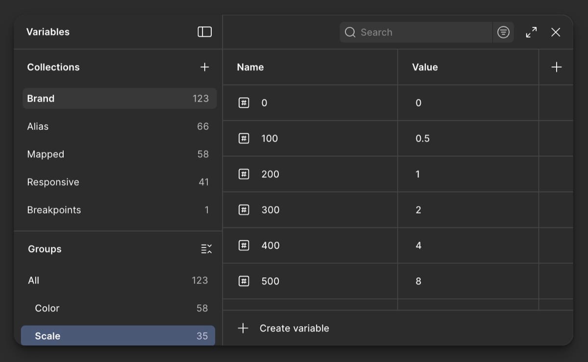
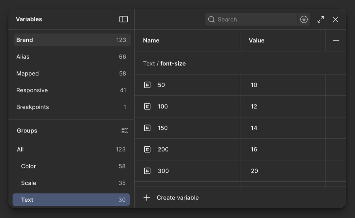
Laying foundations with tokens
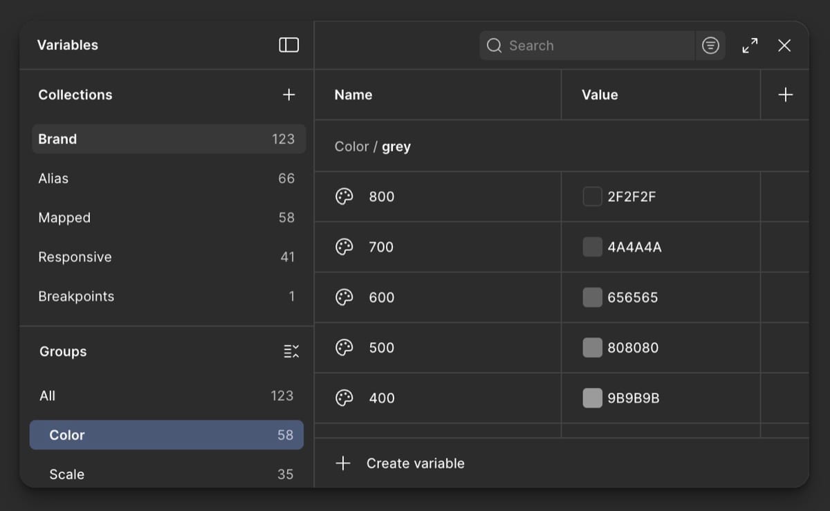
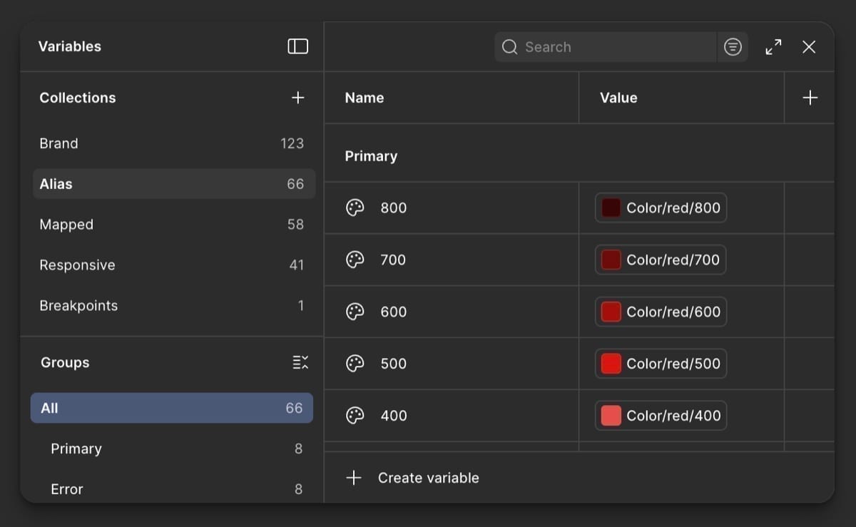
Design tokens defined color, typography, and spacing & sizing: creating consistency across components and a cohesive visual language throughout the system.
03
Assembling the Montage UI kit
A unified UI kit on Figma Community with 40+ components I helped design: buttons, forms, navigation, film/event/schedule modules, cards, carousels, and layout systems.
Montage UI Kit ↗(opens in a new tab)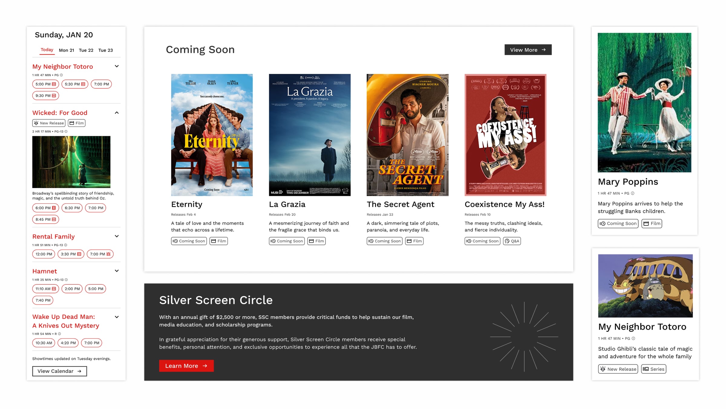
Validation
Validating the cut with real audiences
We tested the system by asking users to recreate pages using Montage components.
- 01
Pages rebuilt efficiently
All users were able to recreate pages efficiently using Montage components.
- 02
Decision friction removed
The system reduced decision-making friction for 100% of users in the sessions.
- 03
Clear next refinements
Feedback highlighted opportunities to refine spacing and expand component variants.

Documentation
Publishing Montage on Zeroheight
Hosted on Zeroheight as the single source of truth: foundations, principles, accessibility standards, component anatomy, and usage guidelines to maintain consistency, reduce onboarding time, and improve team alignment.
Montage Documentation ↗(opens in a new tab)Impact
Consistency, accessibility, and identity
Montage did not just tidy components. It gave JBFC a system for building pages with clarity, access, and a visual language that feels like the organization.
10+ → 1
Consistency and scale
Reduced component variations to a standardized set. 100% of users built pages faster and more consistently.
100%
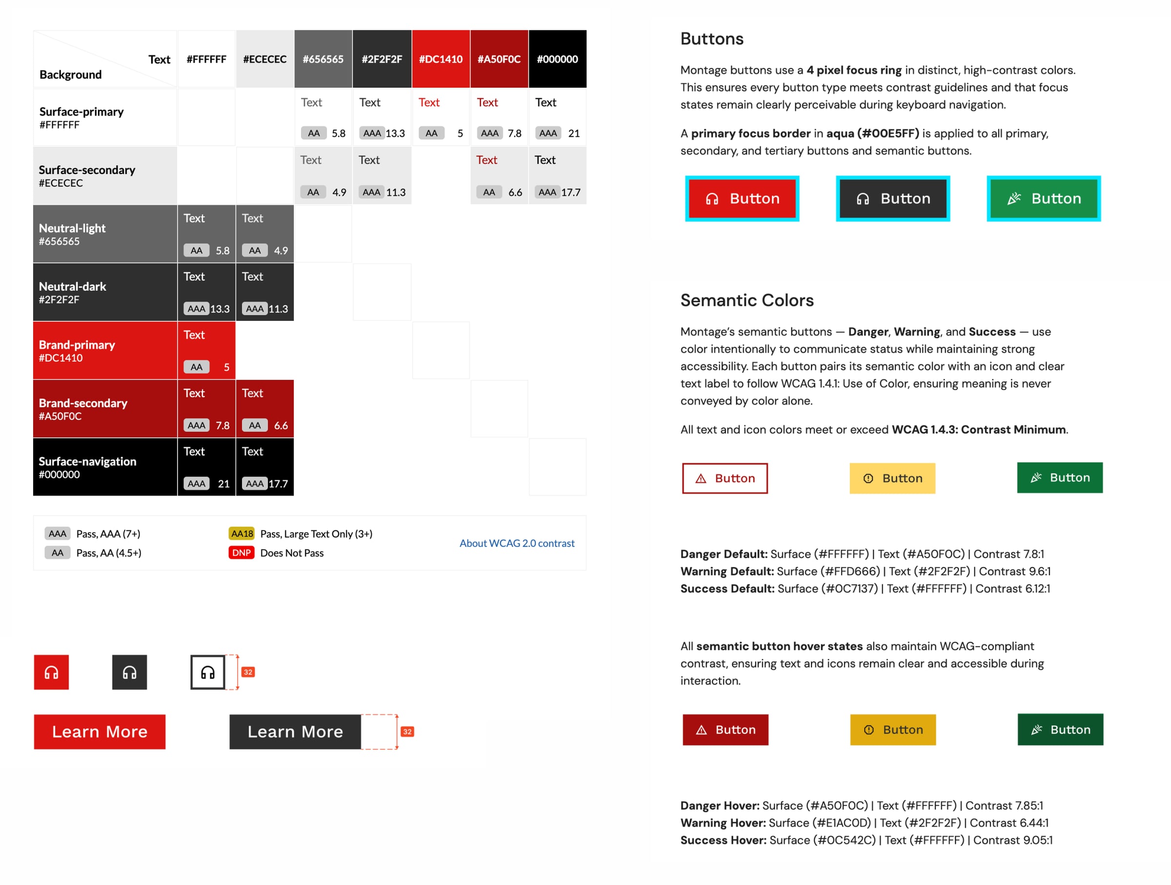
Accessibility at the core
Components meet WCAG contrast standards. Type scales and interaction states stay consistent across the kit.
5+
JBFC design language
Standardized patterns across core page types. Layouts structured for storytelling, not noise.
Design pitch
Showcasing the system in action
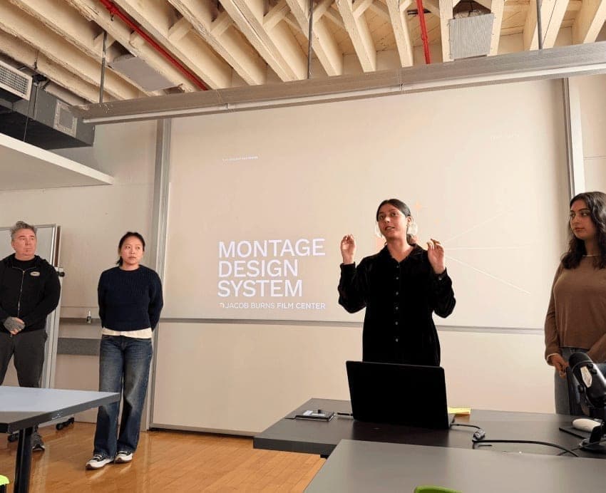
We presented Montage as a complete system to peers, positioning them as JBFC stakeholders. The response validated the clarity of the system, its alignment with JBFC's mission, and its potential to elevate the digital experience.
Montage Pitch Deck ↗(opens in a new tab)
Reflections
What I carry forward
- 01
Building a system mindset
This project pushed me to think beyond individual screens and design at a systems level: studying IBM Carbon to learn structure, constraints, patterns, and decisions that scale across a product.
- 02
Systems as living products
The work deepened my understanding of design systems as living products, and the role systems play in bringing consistency and clarity to digital experiences.
- 03