Fintech · Enterprise product design
Enterprise payment workflows, redesigned for daily billing speed
Redesigned Subscribili's PulsePay dashboard with shorter invoice workflows, accessible payment visualizations, and engineering-ready patterns delivered in four weeks.
38% faster invoice retrieval
5 → 3 billing steps
WCAG AA payment color
4-week sprint to ship
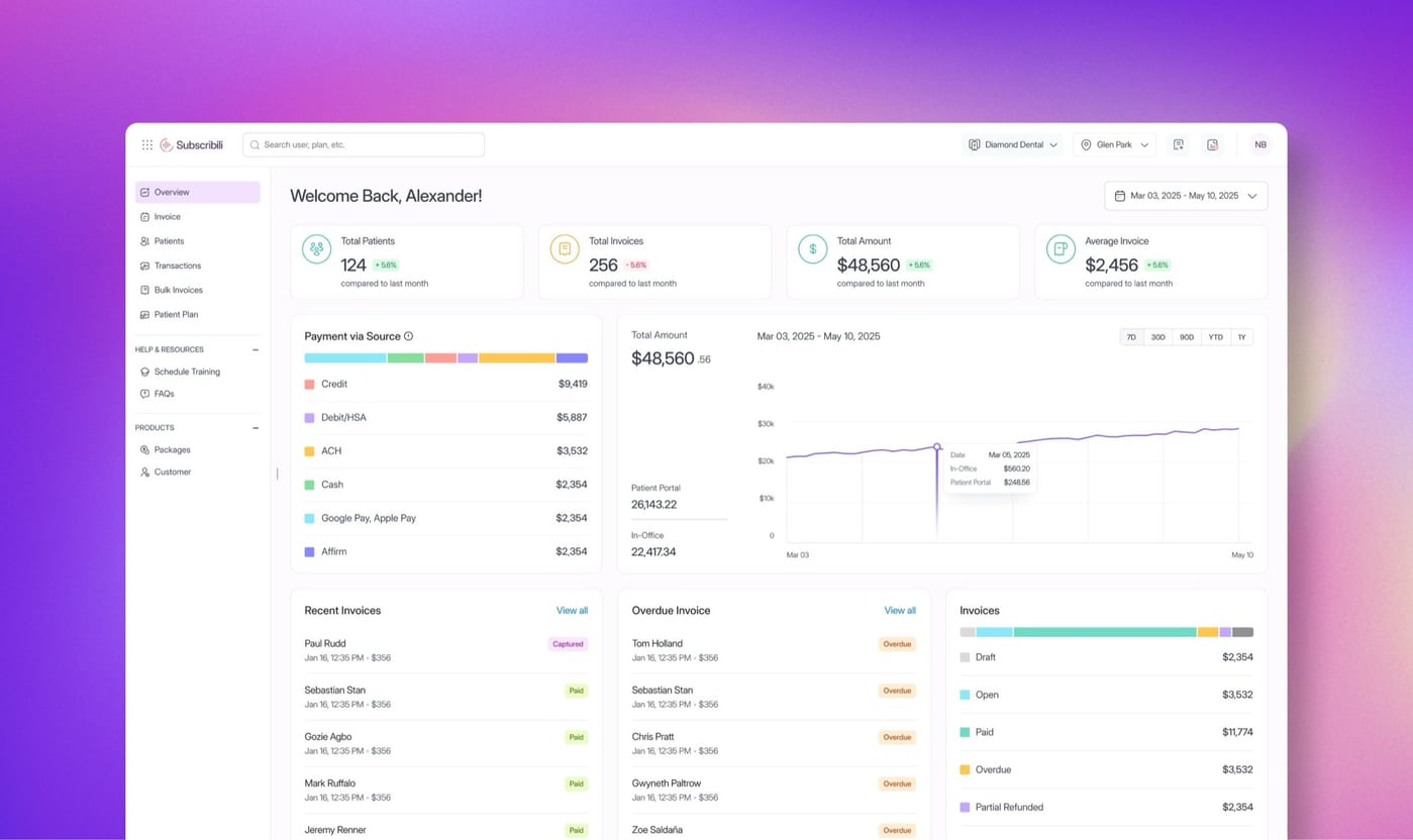
In a 4-week sprint at Subscribili, I led the PulsePay dashboard redesign: cutting high-frequency billing friction, recoding accessible payment visualization, and partnering with product and engineering so the work could ship into the live platform.
- Company
- Subscribili Inc
- Role
- Product designer: dashboard IA, invoice flow, accessible data viz
- Team
- Product Lead · Design Manager · Engineering Lead · Sr Product Designer
- Timeline
- 4 weeks: research-lite sprint to shipped design system updates
Problem
Seconds matter when invoices are daily work
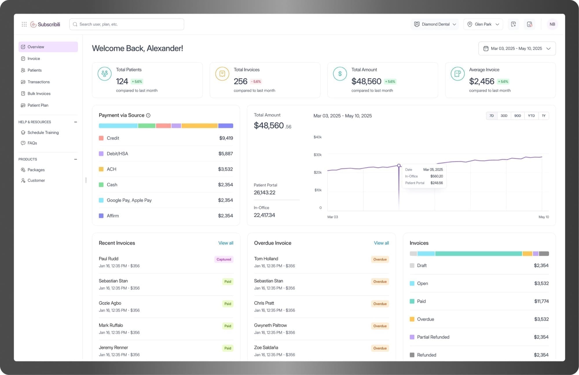
PulsePay is Subscribili's B2B financial platform for Dental Support Organizations. It consolidates invoicing, payments, and reporting across partner practices on Stripe. Finance ops review dozens of invoices a day. When the product adds friction, it multiplies across every practice, every cycle.
Client feedback and product prioritization surfaced two issues that slowed high-frequency use more than missing features.
01
Billing path too long
Invoice-to-payment took 5 steps for daily work: extra screens that added clicks without adding decisions.
02
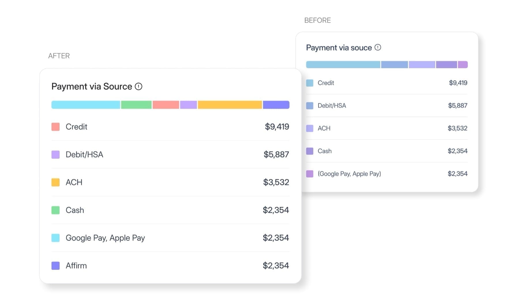
Unreadable payment color
Payment-source codes used similar blues and purples that failed WCAG AA and slowed visual scanning.
Most billing tools offer similar features. What sets them apart is how fast and safely teams finish work they do every day.
Outcome
Faster retrieval, shorter path, shippable patterns
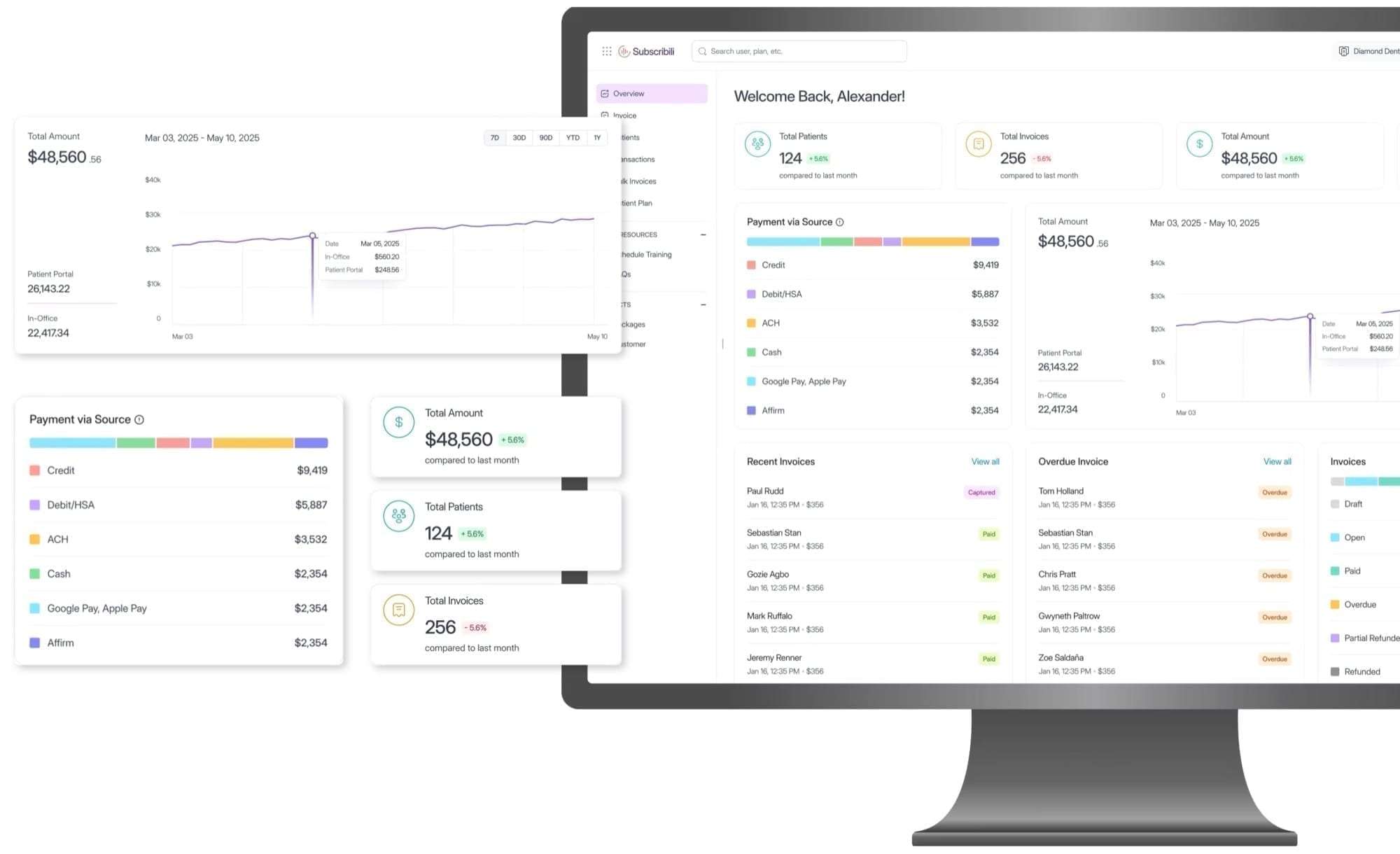
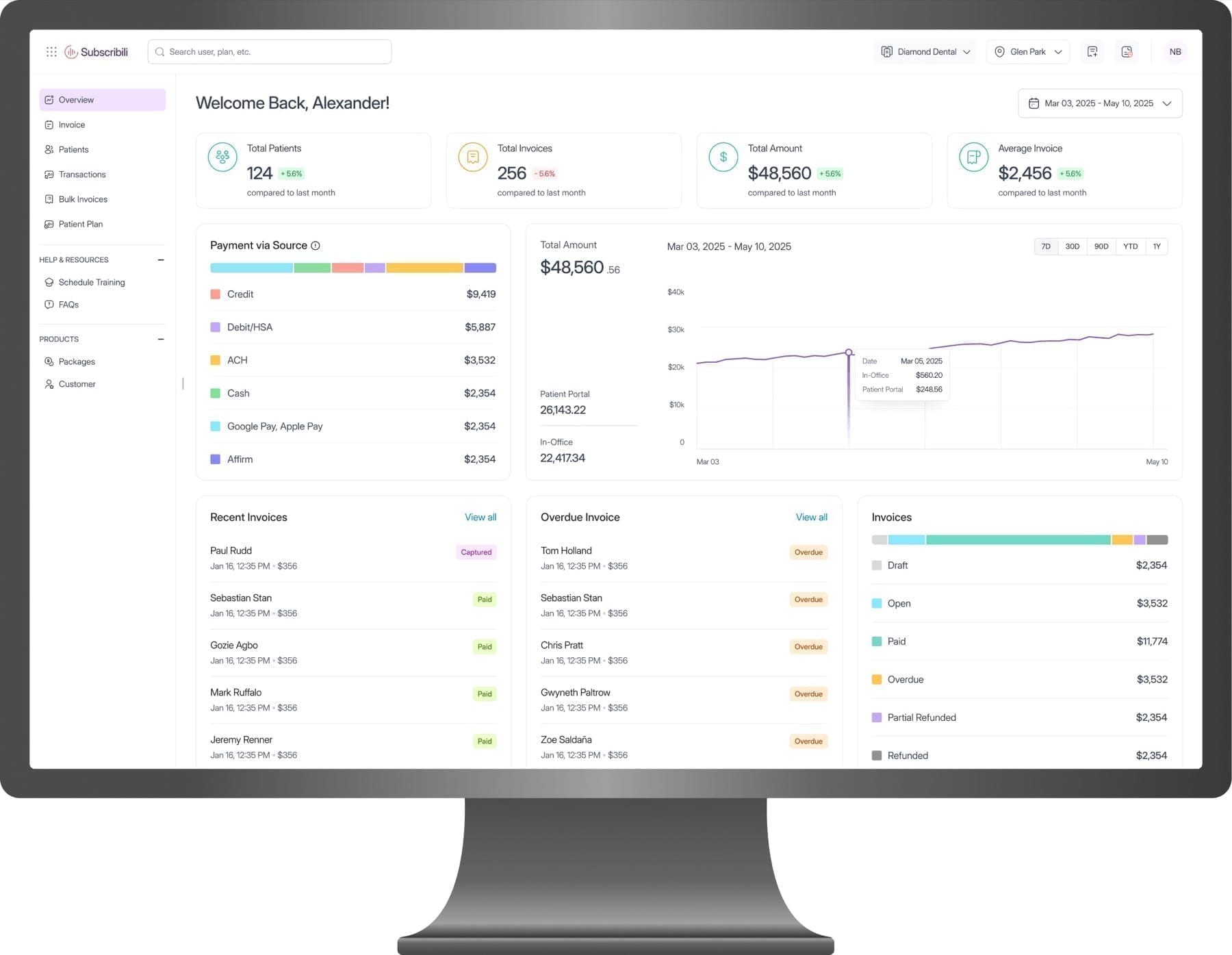
Redesigned the dashboard so billing, payments, and reporting share one high-frequency workspace, with fewer steps, scannable accessible color, and components that match the existing frontend stack.
38%
Invoice retrieval
Faster path: 18s to 11s timed task baseline
5 → 3
Billing flow
Steps removed where no decision was made
Pass
WCAG AA contrast
Payment-source color recoded for scanability
Ship-ready
System reuse
Patterns matched existing frontend architecture
Time metrics compare baseline vs redesigned task paths for primary invoice retrieval, timed during design evaluation (not production analytics). Step count is a hard flow-mapping measure.
Decisions
Two product bets that cut daily friction
Scope was tight. I focused where client pain and design leverage overlapped, not a full product redesign.
01
Accessible color for scannable financial data
Ops users scan status more than they read tables. Near-identical blues and purples failed AA and made payment source hard to distinguish at a glance. I rebuilt the palette for contrast and categorical clarity within brand range, not a new identity system.
02
Shorter invoice path and collapsible IA
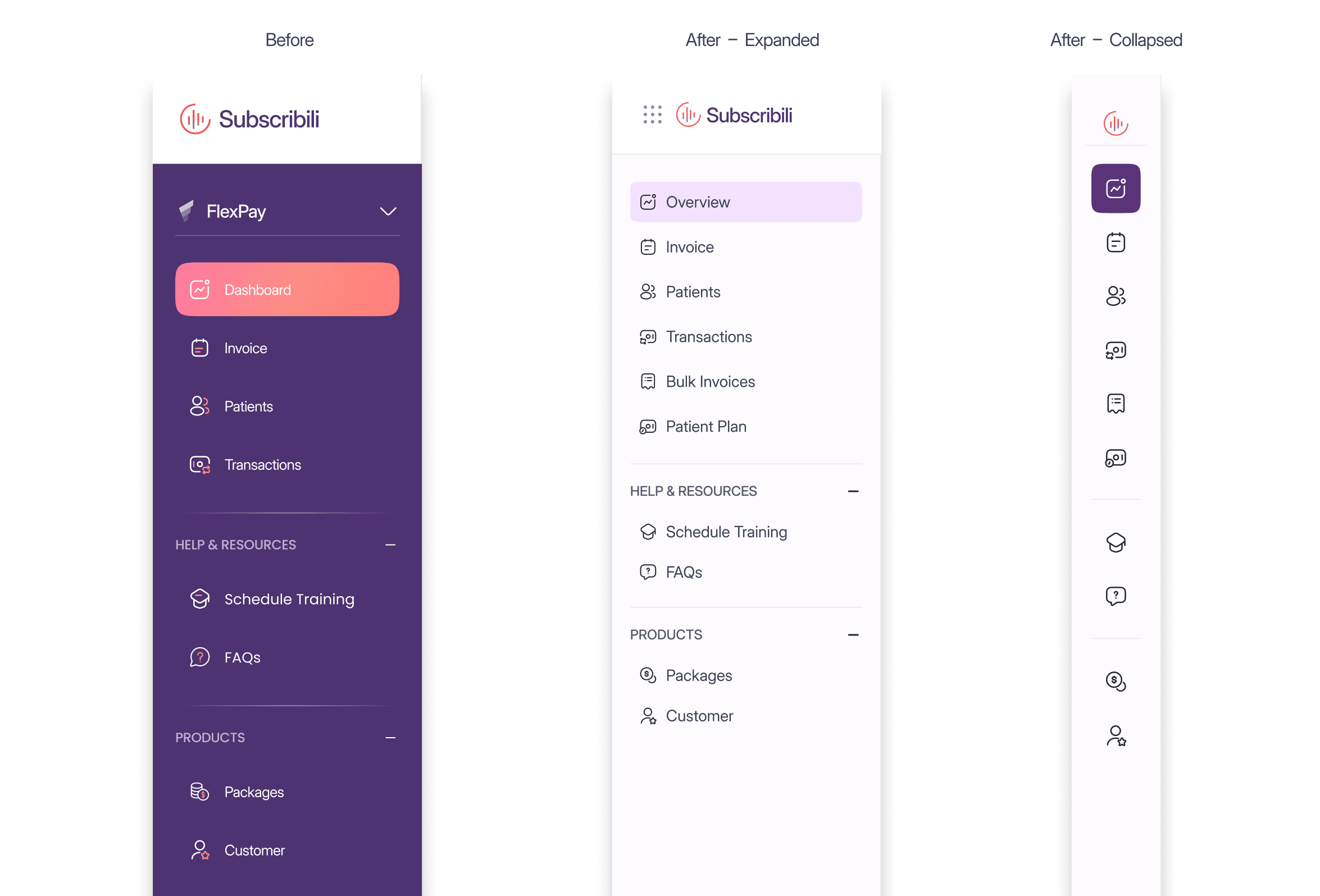
Timed and mapped the invoice-to-payment path; removed steps that added navigation without decisions. Sidebar regrouped with a collapsed state to protect workspace width on a dense ops screen.
Before · 5 steps
After · 3 steps
Collaboration
Feasibility as a design constraint, not a handoff phase
In four weeks, design only lands if engineering and product can take it. Collaboration was how we chose what shipped.
01
Engineering first
Walked interactions early so collapsed nav and edge cases stayed implementable in the existing stack.
02
Product priorities
Step cuts aligned with finance-ops priorities from the Product Lead, not only cleaner IA.
03
Patterns that scale
Components matched frontend architecture so the palette and flow could extend into new financial features.
04
Reviews that unblock
Design reviews resolved implementation questions before build, cutting rework once engineering started.
Tradeoffs
Trade decisions in a four-week sprint
- 01
Collapsed nav vs discoverability
More workspace for dense tables. Cost: deeper discovery for infrequent destinations. Acceptable for expert daily users.
- 02
AA color vs brand history
Recoded categories for contrast over carrying old brand-adjacent hues that failed scan and compliance on live charts.
- 03
Sprint scope vs full platform
Dashboard and invoice path only. Deferred broader reporting IA and empty-state systems for follow-on capacity.
If embedded longer, next I would instrument production time-to-invoice and error rates on color-coded status, then validate the 18s to 11s evaluation delta against live data.